

Before you roll your sleeve and start building your machine learning model, there is one task which you need to perform i.e. Exploratory Data Analysis. The task is to understand your data set and this is where Exploratory Data Analysis Plotting comes into the picture. There are various ways to analyze and visualize the data set, one of the most common methods is to make plots. In this post, we will understand the various Exploratory Data Analysis plotting technique in Python.
It’s obvious that a data scientist or machine learner must know the data set on which she/he is working on and It’s also essential that you have some domain knowledge of the problem as well while working on the particular problem. This post will throw light on tools and techniques using which you can perform Exploratory Data Analysis plotting in Python.
What is Exploratory data analysis?
Exploratory Data Analysis is a task of analyzing the data set to find the features and other important factors that help in building the Machine learning model. Here we can use statistics, Linear algebra and graphs to find the insights of the given dataset.
The idea here is to analyze the main characteristics and features of the dataset especially using some Visual methods. When talking about Visual methods, what is better than plotting charts isn’t it?
Exploratory data analysis plotting and Data set
Plotting a chart about the data sets gives you there actual and accurate representation of the data. Now let’s face it plotting is not easy all the time, as your dimensions increase in your dataset, it becomes hard to plot a graph. It’s very common that you might have more dimensions than 3 or 4 dimensions in a dataset. So in this case what you should do? What techniques you will use to visualize the data? So that’s what we will discover in this post.
Here, we will use the very famous Iris dataset for plotting and demonstration of charts. I choose to use Iris dataset because almost everyone is aware of this dataset. In case if you are not aware of what is Iris dataset, then I would ask you to take a look into it. Download Iris dataset from here, you should get rows separated by a comma. Or you can use the seaborn library to get the Iris dataset using below code.
import seaborn as sns

dataset = sns.load_dataset("iris")
print(dataset)
If you print your dataset, you should see below data frame. The data frame consists of five column sepal_length, sepal_width, petal_length, petal_width, and species.
If you study about Iris dataset, then you will get to know using these columns (sepal_length, sepal_width, petal_length,petal_width) we can determine species of the flower.

Total we have 150 rows of different flowers, if you will print the shape of the data frame you should get below output,
import seaborn as sns

dataset = sns.load_dataset("iris")
print (dataset.shape)

output: (150,5)
Also, you will find that The data is equally divided into 50 rows between all three species. You the below code to find all different species,
import seaborn as sns

dataset = sns.load_dataset("iris")
print (dataset.columns)
dataset['species'].value_counts()

output:

Index(['sepal_length', 'sepal_width', 'petal_length', 'petal_width',
       'species'],
      dtype='object')

setosa        50
virginica     50
versicolor    50
Name: species, dtype: int64
2D Scatter Plot in Python
Creating a 2D plot is the easiest and simplest way to visualize the dataset. We have have been creating 2D plots from a long long time since it’s the easiest way to envision the data in two dimensions. So first we will create a 2D plot using sepal_length and sepal_width column. Use the below code create a 2D plot like this,
# -*- coding: utf-8 -*-
"""
Created on Sun Nov 22 20:13:59 2019, Exploratory Data Analysis plotting in Python
@author: SHASHANK
"""

import seaborn as sns
import matplotlib.pyplot as plt

#Loading the dataset from seaborn library
dataset = sns.load_dataset("iris")

# Plotting graph without colours
sns.set_style("whitegrid");
dataset.plot(kind='scatter', x='sepal_length', y='sepal_width', label='Iris flowers')
plt.title('2D Scatter Plot')
plt.xlabel('sepal_length')
plt.ylabel('sepal_width')
plt.legend()
plt.show()
The output of the above code should look like this,
 The only problem with the above chart is that we can’t bifurcate between the species. If we bifurcate between the species, it would be much easy for us to identify the different species in our dataset. So to bifurcate between the species, use the below code.
# -*- coding: utf-8 -*-
"""
Created on Sun Nov 22 20:13:59 2019, Exploratory Data Analysis plotting in Python
@author: SHASHANK
"""

import seaborn as sns
import matplotlib.pyplot as plt

#Loading the dataset from seaborn library
dataset = sns.load_dataset("iris")

# Plotting graph with colours
sns.set_style("whitegrid");
ax = sns.scatterplot( x='sepal_length', y='sepal_width',hue="species",legend="full", data=dataset)
ax.plot()
The outcome of the above code should look like this,
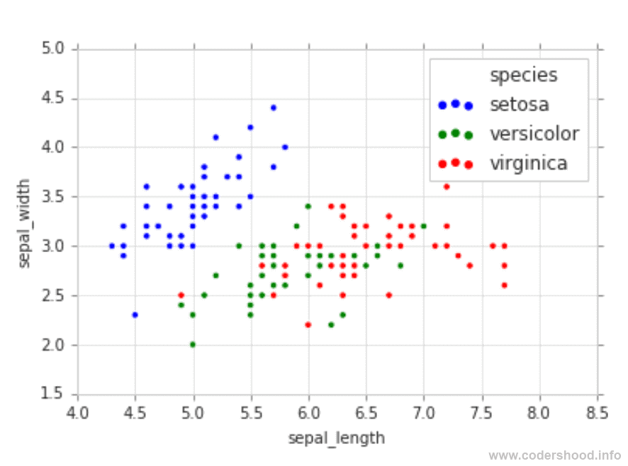
The above chart is very clean and easy to read. As you can see the species are properly separated and each species have different colors. Here, Setosa has a blue color, Versicolor has a green color and lastly, Virginica has a red color. Creating 2D plots are the goto method for visualization and analyzing the data
3D Scatter Plot in Python
We humans can see things in three dimensions, so it’s obvious that we can plot our data in three dimensions and visualize it. It becomes difficult to visualize when we start plotting for 4D, 5D and so on. It very common in data science and machine learning that you might have more dimensions than 3 or 4 dimensions in a dataset.
In the above 2D plot we can’t bifurcate the difference between the Versicolor and Verginica species. Both the species are mixed with each other, so what can we do in this situation! Well, you can create 3D plots to spot the differences.
Creating 3D plots can be time-consuming. In this case, you can take help of some online tools such as plotly. The example of Iris dataset can be found here on plotly or you can use the python script to create a 3D plot for Iris dataset.
4-D, 5-D or n-D scatter plot Or Pair-plot
What if you have more than 3 Dimensions to work with. And I said earlier It very common in data science and machine learning that you might have more dimensions than 3 or 4 dimensions in a dataset.
In this situation, the pair plot can be very helpful and easy to understand. But pair plots also have limits, when you are working with a dataset which has a high number of feature. Use the below code to create the pair plot,
# -*- coding: utf-8 -*-
"""
Created on Sun Nov 22 20:13:59 2019, Exploratory Data Analysis plotting in Python
@author: SHASHANK
"""

import seaborn as sns
import matplotlib.pyplot as plt

#Loading the dataset from seaborn library
dataset = sns.load_dataset("iris")

sns.pairplot(dataset, hue="species", height=3)
The outcome of the above code will look like this. After seeing the pair plot, I can definitely say that I would work with petal_width and petal_height. Since petal_width and petal_height are easily separable hence it will easy for me to create a machine learning model.
The diagonal charts are PDFs for each feature. We will talk about PDF in the upcoming section.

The 1D plot in Python
It is possible to create a 1D plot with only one feature in the dataset? Yes, It’s absolutely possible and in this section, we will create 1D charts using only One feature. But why we need 1D plots and how can we get data out of it?
Personally, I don’t use it very often, but sometimes it can be very helpful to determine the density of the features. 1D plots can give you an insight which feature is more dominating over other features. Use the below code to create 1D plots,
# -*- coding: utf-8 -*-
"""
Created on Sun Nov 22 20:13:59 2019, Exploratory Data Analysis plotting in Python
@author: SHASHANK
"""

import seaborn as sns
import matplotlib.pyplot as plt
import numpy as np

#Loading the dataset from seaborn library
dataset = sns.load_dataset("iris")

#Getting species as a seprate dataset
iris_setosa = dataset.loc[dataset["species"] == "setosa"];
iris_virginica = dataset.loc[dataset["species"] == "virginica"];
iris_versicolor = dataset.loc[dataset["species"] == "versicolor"];

sns.set_style("whitegrid");
ax = sns.scatterplot( x='petal_length', y= np.zeros_like(iris_setosa['petal_length']), s=50, color="blue", data=iris_setosa)
ax = sns.scatterplot( x='petal_length', y= np.zeros_like(iris_virginica['petal_length']), s=50,color="green", data=iris_virginica)
ax = sns.scatterplot( x='petal_length', y= np.zeros_like(iris_versicolor['petal_length']),s=50, color="red", data=iris_versicolor)
ax.plot()
The outcome of the above code is shown below. In the below chart, there is only one problem. It is very difficult to find out how many points are in particular region of the x-axis.

Histograms and PDF
So how we solve this problem? There is one solution to find out how many points are in particular region of the x-axis and i.e. Histograms. Histograms can easily solve this issue by creating pillars on X-axis for each point. This idea will more clear when we use the below code to create a histogram for the above chart,
# -*- coding: utf-8 -*-
"""
Created on Sun Nov 22 20:13:59 2019, Exploratory Data Analysis plotting in Python
@author: SHASHANK
"""

import seaborn as sns
import matplotlib.pyplot as plt

#Loading the dataset from seaborn library
dataset = sns.load_dataset("iris")

#Getting species as a seprate dataset
iris_setosa = dataset.loc[dataset["species"] == "setosa"];
iris_virginica = dataset.loc[dataset["species"] == "virginica"];
iris_versicolor = dataset.loc[dataset["species"] == "versicolor"];

sns.set_style("whitegrid");
ax = sns.distplot(iris_setosa['petal_length'])
ax = sns.distplot(iris_virginica['petal_length'])
ax = sns.distplot(iris_versicolor['petal_length'])
ax.plot()
The Histogram of the above code should look like below image. Here the X-axis is the petal_length and the Y-axis is the count of points. This far helpful as compared to 1 Dimensional chart we saw before.

Now we know why to use Histograms, but you must be wondering, what is that smooth line above the Histogram of each species. This smooth line is called a Probability Density Function in short PDF.

According to Wikipedia,
In probability theory, a probability density function (PDF), or density of a continuous random variable, is a function whose value at any given sample (or point) in the sample space (the set of possible values taken by the random variable) can be interpreted as providing a relative likelihood that the value of the random variable would equal that sample.
This basically is a probability law for a continuous random variable, say X. You can read more about Probability Density Function here.
Box plot and Whiskers
A Box plot is a type of chart which displays the set of numerical data based on quartiles. Box plots basically used to depict the particular region between different percentiles. The main usage is to find out the distribution of points using quartiles. To create a Box plot use the below code,
# -*- coding: utf-8 -*-
"""
Created on Sun Nov 22 20:13:59 2019, Exploratory Data Analysis plotting in Python
@author: SHASHANK
"""

import seaborn as sns
import matplotlib.pyplot as plt

#Loading the dataset from seaborn library
dataset = sns.load_dataset("iris")

sns.set_style("whitegrid");
ax = sns.boxplot(x='species',y='petal_length', data=dataset)
ax.plot()
The outcome of the above code will look like below image. In the below image, the box is an area of three percentiles and the vertical lines are minimum and maximum values. These vertical lines are called Whiskers, hence the name Box plot and Whiskers.
 Violin plots
The Violin plots are a combination of the histogram PDF and the box plot giving you one of the best ways to analyze the data. The violin plots create a box plot along with the histogram PDF of a particular feature. Creating a Violin plot are very easy, use the below code to Violin plot.
import seaborn as sns
import matplotlib.pyplot as plt

#Loading the dataset from seaborn library
dataset = sns.load_dataset("iris")

sns.set_style("whitegrid");
ax = sns.violinplot(x="species", y="petal_length", data=dataset, size=5)
ax.plot()
The output of the above code should like below plot. The output of the above code should like below plot. In the below plot the smooth carves are nothing but the PDF of each species. And if you look closely, you find the boxes inside each region in black color. Hence it becomes a combination of the histogram PDF and the box plot.
Conclusion
In this post, we studied about the different Exploratory Data Analysis plotting technique. We saw 2D scatter plots, 3D scatter plots, and 1D scatter plots and their usage along with source code. Out of the box we discussed Histograms and PDF, Box plot Whiskers and Violin plots. I am very excited to know what kind of plotting technique and tools you use, do share in below comment box?
In case if you have any questions regarding this topic, ask your questions in below comment section. If you want to read moremachine learning articlessubscribe to our Newsletter and I’ll see you in the next post.


